
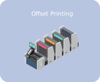
Offset printing
The workhorse for large quantities. Excellent color accuracy, and the cost per piece drops as the quantity grows.
Print has its own language. CMYK, bleed, DPI, saddle stitch — words that can make a simple job feel complicated. This guide explains the essentials in plain terms, so your next print project goes smoothly from file to finished piece.
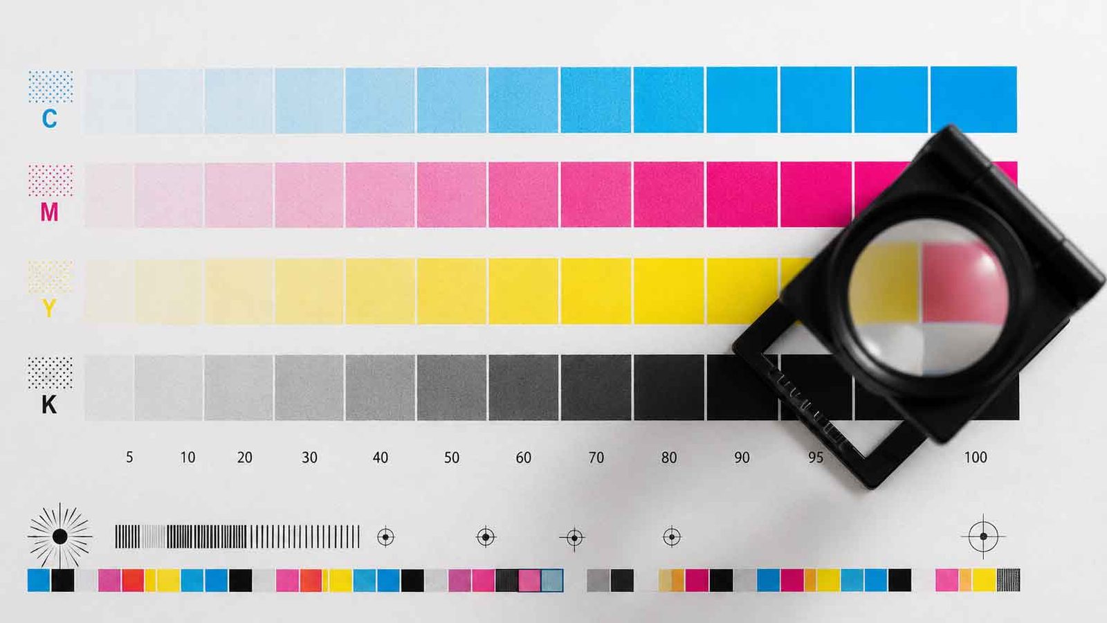
A press control strip: every job is checked against these patches before the run begins.
Four inks: cyan, magenta, yellow, and black. Mixed together in tiny dots, they create almost every color you see in magazines, catalogs, and packaging. This is the standard for printing.
Red, green, and blue light. This is how screens show color. A file made in RGB must be converted to CMYK before printing — and some bright screen colors simply cannot be matched by ink. That is why a print sometimes looks different from your monitor.
Pre-mixed inks with exact recipes. When a brand color must look identical on every business card, sign, and box, Pantone is the answer.
The workhorse for large quantities. Excellent color accuracy, and the cost per piece drops as the quantity grows.
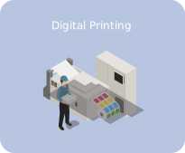
No plates, no long setup. Ideal for short runs, fast turnarounds, and jobs where every copy can be different. This is the heart of on-demand printing.
Widely used for packaging and labels, printing vibrant, durable color on many materials.
Ink cured instantly by ultraviolet light. It prints vivid, durable color even on difficult surfaces like plastic.
Bold, uniform color on textiles, posters, and promotional items.
The oldest craft of them all: type pressed into the paper, leaving a subtle impression you can feel. Chosen for high-end invitations and bespoke stationery.
A cross between digital printing and screen printing, using soy-based inks. A limited but vivid color palette gives posters, flyers, and zines a distinctive vintage character — and it is one of the more eco-friendly options.
Heat, not ink. A print head warms heat-sensitive paper to form the image — the method behind receipts and barcode labels, valued for speed in high-volume work.
Photographs are raster images: grids of colored pixels. For print, they need 300 DPI at final size. Enlarge them too much and they turn blurry — pixels cannot be invented.
Logos and line art drawn as mathematical shapes. They scale to any size — a name card or a building banner — with no loss of sharpness. Your logo should always exist as a vector file.
For final delivery, a press-quality PDF with crop marks and bleed is the safest format.
Paper is printed larger than the final size, then trimmed. Bleed means extending your background 3 mm (1/8 inch) past the trim line, so a tiny shift in cutting never leaves a white sliver at the edge. Crop marks are the small lines that tell the cutter exactly where to trim. Together, they make clean edges possible.
One color printed on top of another. Used deliberately for subtle effects, or to keep small black text crisp over a colored background.
The opposite: the background color is removed underneath a shape or text, so inks never mix. This keeps logos and colors clean and true.
Not a person's name. In printing, a signature is a set of pages printed together on one large sheet, then folded and bound. It is why page counts for books often work best in multiples of 4, 8, or 16.
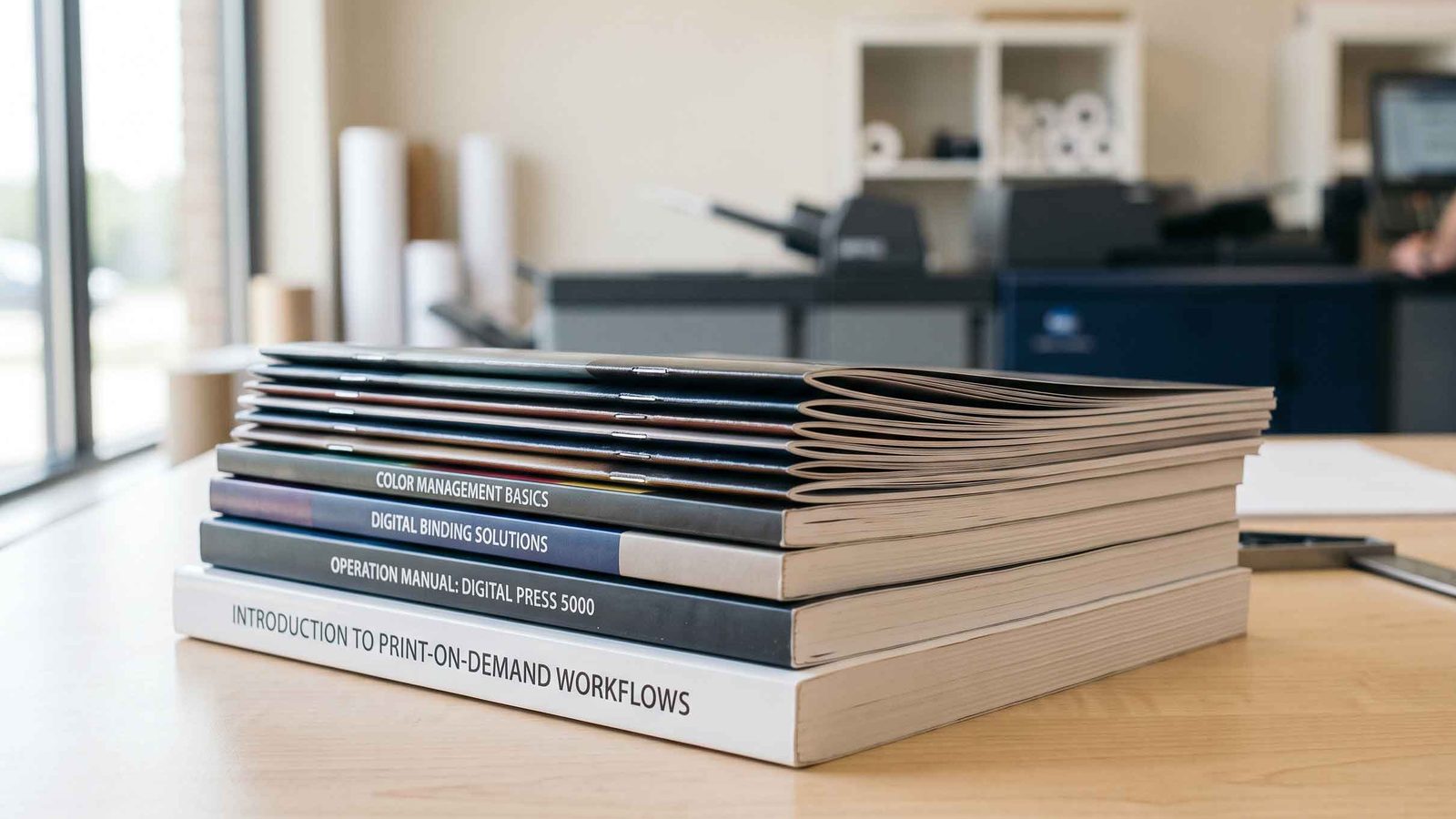
Saddle-stitched booklets and perfect-bound manuals, finished and stacked.
Folded sheets stapled at the spine. Economical, best for booklets and brochures.
Pages glued into a spine, like a paperback. A professional look for catalogs and books.
A coil through punched holes. Lies completely flat — ideal for manuals and calendars.
Pages sewn or glued into a rigid cover, for premium books.
A few more terms, so nothing in the conversation catches you off guard.
The weight, and so the thickness, of paper. A flyer is typically 80–130 gsm; a box wants 250–350 gsm.
Art paper is coated and smooth, made for vivid color; bond paper is uncoated — the everyday paper of documents and forms.
The thin metal master that carries the image in offset printing — one plate per ink, four for full color.
A test print checked and approved before the real run begins. Minutes spent here save reprints later.
A physical sample of the finished piece, folded and assembled, so you hold the result before committing to hundreds.
A trim is the plain straight cut that squares the edges; a die-cut follows a custom shape — rounded corners, windows, boxes. The straight cut costs less; the shaped one gets noticed.
The quiet zone inside the trim line where text must stay; the twin of bleed, which lives outside it.
A glossy coating applied only where you choose — a logo, a title — so it catches the light against a matte surface.
Several different jobs printed together on one shared sheet to split the cost. Cheaper; a single run costs more but gives each job its own color control.
The days between placing the order and holding the goods. Ask early; presses queue like everyone else.
The English terms above all have Thai counterparts on the shop floor. A few of them do not translate the way you would expect — and knowing them saves a long conversation.
Say ตัดตก to a Bangkok printer and your file is understood at once. Say “bleed” and you may get a pause.
File check, color check, proof, then press. If you are unsure whether your files are print-ready, send them to us.
Checking is free; reprinting is not.
Page layout, typography, and the craft of multilingual documents.
Read the guide → Topic 03Translation, culture, and formats — going global by going local.
Read the guide → Topic 04Manuals people can actually follow — with zero confusion.
Read the guide → Topic 05Layers, dielines, and finishes — three jobs in one box.
Read the guide → Topic 06Design thinking, the Double Diamond, and how projects run.
Read the guide → Topic 07Warehouse, assembly, and delivery — from press to doorstep.
Read the guide →